> ## Documentation Index
> Fetch the complete documentation index at: https://help.wtpbiz.com/llms.txt
> Use this file to discover all available pages before exploring further.
# Setup Gallery Wall Products
> Create and configure Gallery Wall products in Shopify and the app
## Create a New Product in Shopify
Each gallery wall layout is sold as a separate Shopify product. Set up the product in Shopify first, then configure it inside the app.
1. In your Shopify admin, go to **Products > Add product**.
2. Enter the product **Name** (e.g., `5 Frame Gallery Wall`, `2 Frame Set`).
3. Add product **Media** (cover image representing the layout).
4. Under **Variants**, add a variant option named `Frame` and create values for each frame style you offer (e.g., Black, White, Oak). Set a price for each.
5. Under **Theme template** (in the product settings), select the **Gallery Wall** template created in the Integration step.
6. Click **Save**.
Each frame variant value (Black, White, Oak) will later be mapped to a thumbnail and frame overlay image inside the app.
## Add the Product to the App
After creating the Shopify product, add it to the app to configure its gallery layout, frame styles, and border options.
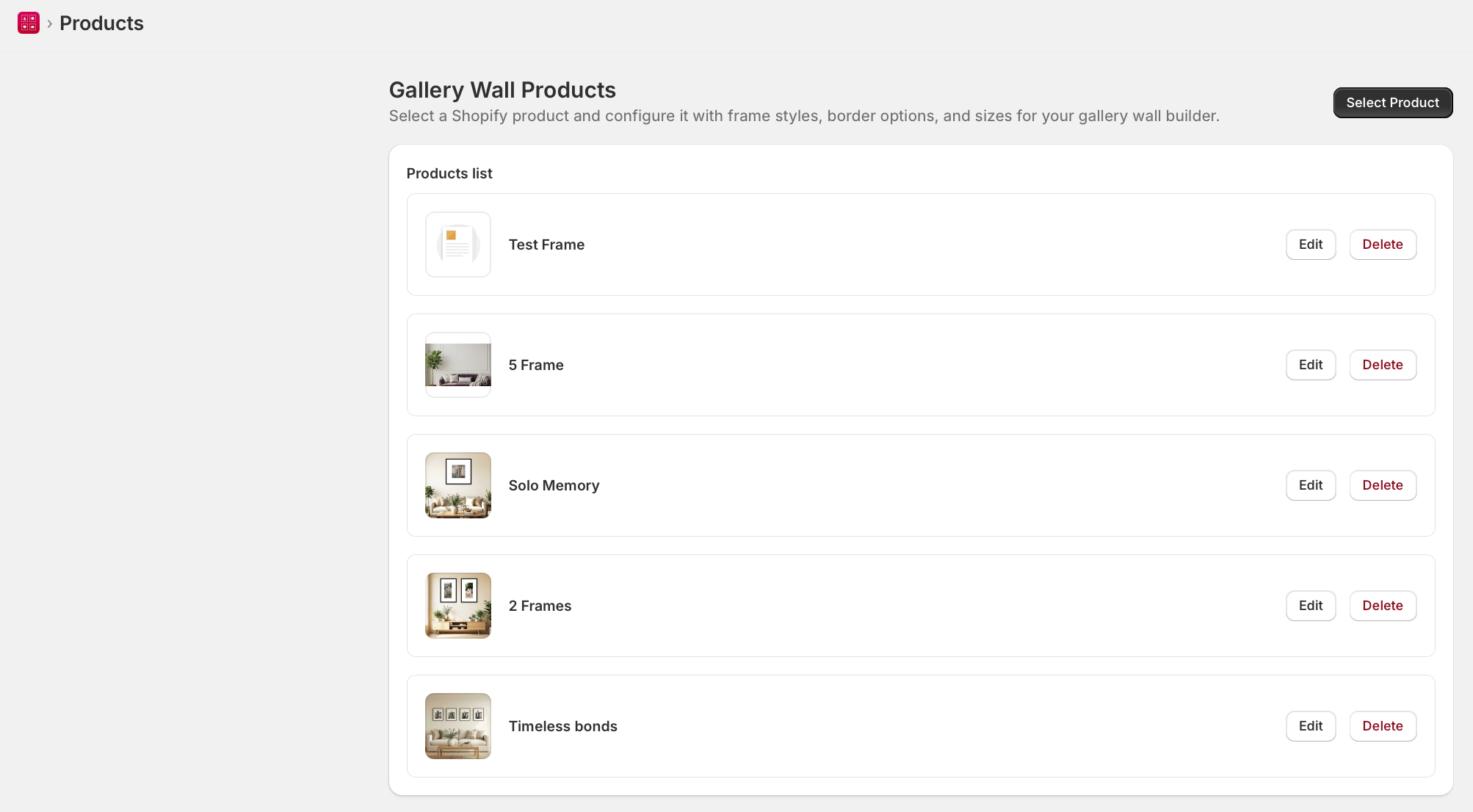 1. Go to **WTPBiz Gallery Wall > Products**.
2. Click **Select Product**.
3. Search for and select the Shopify product you created. It will appear in the Products list.
4. Click **Edit** to configure the product's gallery layout.
## Configure Gallery Wall Layout
Inside each product's configuration, set the dimensions and grid layout of the gallery wall frames.
| Setting | Description |
| ------------ | ------------------------------------------------------ |
| Frame Width | Width of a single frame (in cm or inches per Settings) |
| Frame Height | Height of a single frame |
| Rows | Number of rows of frames in the grid |
| Columns | Number of columns of frames in the grid |
| Gap | Space between frames (same unit as width/height) |
1. Enter **Frame Width** (e.g., `20` for a 20cm wide frame).
2. Enter **Frame Height** (e.g., `30` for a 20x30cm frame).
3. Enter **Rows** (e.g., `1` for a single-row gallery).
4. Enter **Columns** (e.g., `3` for 3 frames per row).
5. Enter **Gap** (e.g., `2` for 2cm between frames).
6. Click **Save**.
Example: Rows=1, Columns=5, Width=20, Height=30, Gap=2 creates a 5-frame horizontal gallery where each frame is 20x30cm with 2cm gaps.
## Setup Frame Variants
Each frame variant (e.g., Black, White, Oak) needs a thumbnail image shown in the selector and an overlay image placed on top of customer photos.
1. In the product configuration, scroll to the **Frame Variants** section.
2. For each variant, upload:
* **Thumbnail** – A small square image shown in the frame style picker (e.g., a corner photo of the frame).
* **Frame Image** – A transparent PNG image that overlays on the customer's photos. The center area must be cut out. Square format preferred.
3. Repeat for all frame variant values (Black, White, Oak, etc.).
4. Click **Save**.
Sample frame overlay PNG images are available from the WTPBiz resources page. Frame overlay images must have a transparent center so photos show through.
## Add Border Options
Border options define the mat spacing between the photo edge and the frame border. Customers select a border option when customizing their gallery.
1. In the product configuration, scroll to the **Border Options** section.
2. Click **Add Border Option**.
3. For each border option, fill in:
* **Title** – Name shown to customers (e.g., Small, Medium, Large, 3 CM, 5 CM).
* **Thumbnail** – A small square image illustrating the border size.
* **Value** – The actual border size in your chosen unit (e.g., `3` means 3cm border around the photo inside the frame).
4. Add as many border options as needed (e.g., No Border, Small, Medium, Large).
5. Click **Save**.
Border values are entered in the unit selected in Settings (cm or inches). The value represents the space added around the photo inside the frame edge.
1. Go to **WTPBiz Gallery Wall > Products**.
2. Click **Select Product**.
3. Search for and select the Shopify product you created. It will appear in the Products list.
4. Click **Edit** to configure the product's gallery layout.
## Configure Gallery Wall Layout
Inside each product's configuration, set the dimensions and grid layout of the gallery wall frames.
| Setting | Description |
| ------------ | ------------------------------------------------------ |
| Frame Width | Width of a single frame (in cm or inches per Settings) |
| Frame Height | Height of a single frame |
| Rows | Number of rows of frames in the grid |
| Columns | Number of columns of frames in the grid |
| Gap | Space between frames (same unit as width/height) |
1. Enter **Frame Width** (e.g., `20` for a 20cm wide frame).
2. Enter **Frame Height** (e.g., `30` for a 20x30cm frame).
3. Enter **Rows** (e.g., `1` for a single-row gallery).
4. Enter **Columns** (e.g., `3` for 3 frames per row).
5. Enter **Gap** (e.g., `2` for 2cm between frames).
6. Click **Save**.
Example: Rows=1, Columns=5, Width=20, Height=30, Gap=2 creates a 5-frame horizontal gallery where each frame is 20x30cm with 2cm gaps.
## Setup Frame Variants
Each frame variant (e.g., Black, White, Oak) needs a thumbnail image shown in the selector and an overlay image placed on top of customer photos.
1. In the product configuration, scroll to the **Frame Variants** section.
2. For each variant, upload:
* **Thumbnail** – A small square image shown in the frame style picker (e.g., a corner photo of the frame).
* **Frame Image** – A transparent PNG image that overlays on the customer's photos. The center area must be cut out. Square format preferred.
3. Repeat for all frame variant values (Black, White, Oak, etc.).
4. Click **Save**.
Sample frame overlay PNG images are available from the WTPBiz resources page. Frame overlay images must have a transparent center so photos show through.
## Add Border Options
Border options define the mat spacing between the photo edge and the frame border. Customers select a border option when customizing their gallery.
1. In the product configuration, scroll to the **Border Options** section.
2. Click **Add Border Option**.
3. For each border option, fill in:
* **Title** – Name shown to customers (e.g., Small, Medium, Large, 3 CM, 5 CM).
* **Thumbnail** – A small square image illustrating the border size.
* **Value** – The actual border size in your chosen unit (e.g., `3` means 3cm border around the photo inside the frame).
4. Add as many border options as needed (e.g., No Border, Small, Medium, Large).
5. Click **Save**.
Border values are entered in the unit selected in Settings (cm or inches). The value represents the space added around the photo inside the frame edge.